case1

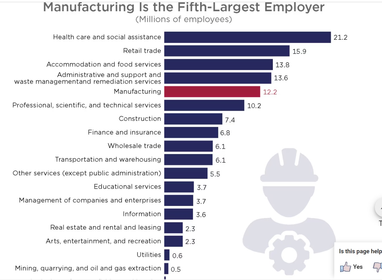
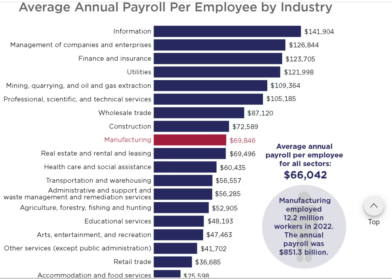
Concerns Regarding the Census Bureau’s Manufacturing Payroll Visualizations

Problem Statement:

The visuals on the U.S. Census Bureau website are flawed since they don’t go far enough into comparing payrolls and employment in manufacturing across different areas or subsectors. Additionally, because of the design’s relative simplicity, it is more difficult to convey subtleties like historical patterns or outside variables’ influence (such as automation or changes in the economy). Beyond a high-level comparison with other industries, the capacity to deliver actionable insights is limited by the visual concentration on a small number of fundamental parameters.

Reference: United States Census Bureau. January 31, 2024. producing payroll for employers. United States Department of Commerce. Manufacturing Employer Payroll: https://www.census.gov/library/visualizations/2024/econ.html

library(tidyverse)
── Attaching core tidyverse packages ──────────────────────── tidyverse 2.0.0 ──
✔ dplyr     1.1.4     ✔ readr     2.1.5
✔ forcats   1.0.0     ✔ stringr   1.5.1
✔ ggplot2   3.5.1     ✔ tibble    3.2.1
✔ lubridate 1.9.3     ✔ tidyr     1.3.1
✔ purrr     1.0.2     
── Conflicts ────────────────────────────────────────── tidyverse_conflicts() ──
✖ dplyr::filter() masks stats::filter()
✖ dplyr::lag()    masks stats::lag()
ℹ Use the conflicted package (<http://conflicted.r-lib.org/>) to force all conflicts to become errors
library(ggplot2)
library(lattice)
employees_info <- data.frame(
  Respective_Sectors = c("Health", "Retail", "Accom & Food", "Admin & Waste",
                         "Mfg.", "Prof. Serv.", "Constr.", "Finance",
                         "Wholesale", "Transp.", "Other Serv.", "Edu.",
                         "Co. Mgmt.", "Info.", "Real Est.", "Arts & Rec.",
                         "Util.", "Mining & Oil", "Agri."),
  Avg_Employees_In_Mlns = c(21.2, 15.9, 13.8, 13.6, 12.2, 10.2, 7.4, 6.8,
                            6.1, 6.1, 5.5, 3.7, 3.7, 3.6, 2.3, 2.3, 0.6, 0.5, 0.2)
)  
print(employees_info)
   Respective_Sectors Avg_Employees_In_Mlns
1              Health                  21.2
2              Retail                  15.9
3        Accom & Food                  13.8
4       Admin & Waste                  13.6
5                Mfg.                  12.2
6         Prof. Serv.                  10.2
7             Constr.                   7.4
8             Finance                   6.8
9           Wholesale                   6.1
10            Transp.                   6.1
11        Other Serv.                   5.5
12               Edu.                   3.7
13          Co. Mgmt.                   3.7
14              Info.                   3.6
15          Real Est.                   2.3
16        Arts & Rec.                   2.3
17              Util.                   0.6
18       Mining & Oil                   0.5
19              Agri.                   0.2
payroll_info <- data.frame(
  Respective_Sectors = c("Health", "Retail", "Accom & Food", "Admin & Waste",
                         "Mfg.", "Prof. Serv.", "Constr.", "Finance",
                         "Wholesale", "Transp.", "Other Serv.", "Edu.",
                         "Co. Mgmt.", "Info.", "Real Est.", "Arts & Rec.",
                         "Util.", "Mining & Oil", "Agri."),
  Avg_Payroll_In_Dollars = c(60435, 36685, 25598, 56285, 69846, 105185,
                             72589, 123705, 87120, 56557, 41702, 48193,
                             126844, 141904, 69496, 47463, 121998, 109364, 52905)
)

print(payroll_info)
   Respective_Sectors Avg_Payroll_In_Dollars
1              Health                  60435
2              Retail                  36685
3        Accom & Food                  25598
4       Admin & Waste                  56285
5                Mfg.                  69846
6         Prof. Serv.                 105185
7             Constr.                  72589
8             Finance                 123705
9           Wholesale                  87120
10            Transp.                  56557
11        Other Serv.                  41702
12               Edu.                  48193
13          Co. Mgmt.                 126844
14              Info.                 141904
15          Real Est.                  69496
16        Arts & Rec.                  47463
17              Util.                 121998
18       Mining & Oil                 109364
19              Agri.                  52905
colnames(employees_info)[1] <- "Respective_Sectors" 
colnames(payroll_info)[1] <- "Respective_Sectors"  


merging_info <- merge(employees_info, payroll_info, by ="Respective_Sectors")

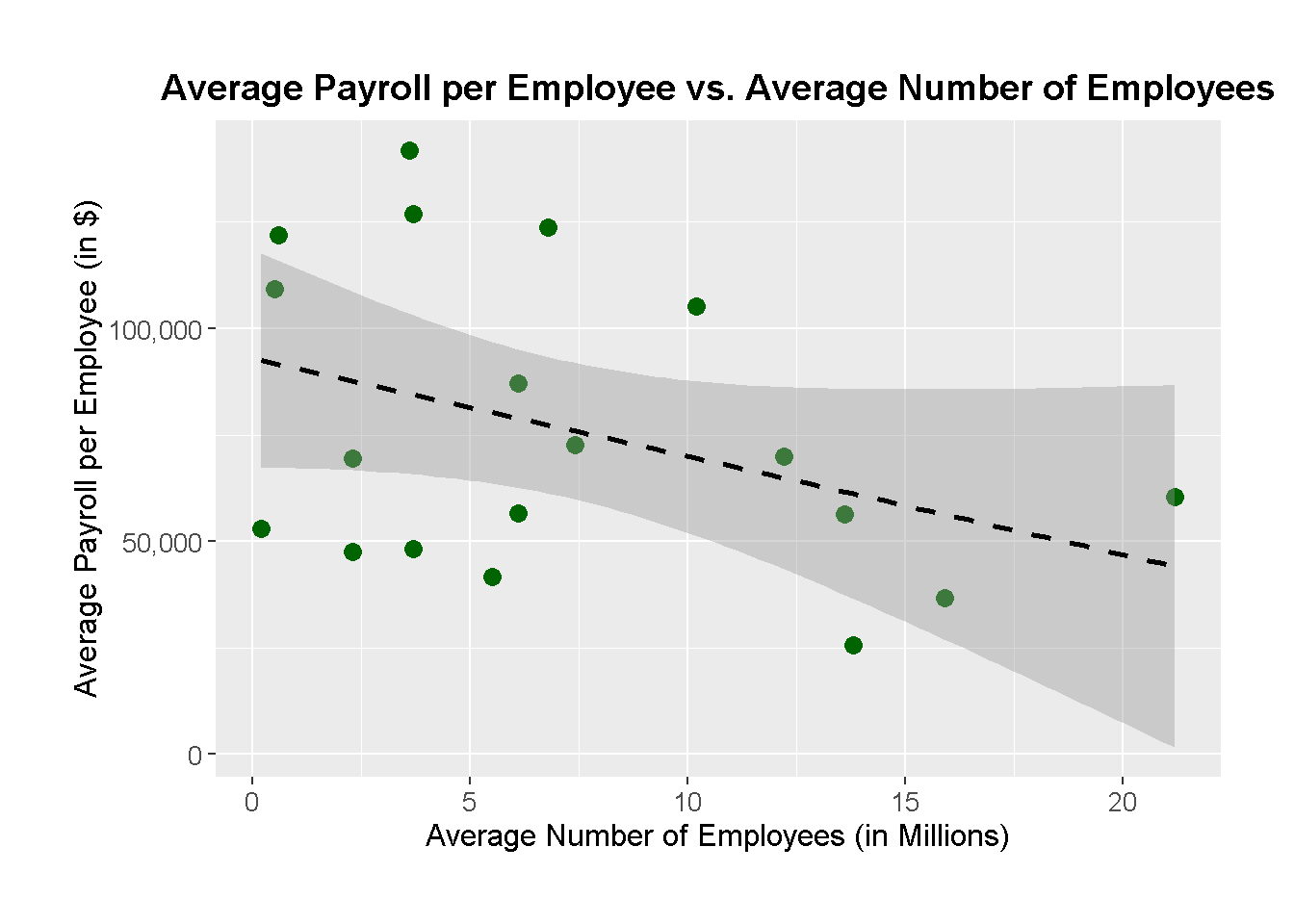
1. Payroll vs Workers (Linear Regression Scatter Plot):
The average payroll per employee is plotted against the average number of employees, expressed in millions. The trend between these two variables is depicted by the dashed black regression line, which implies that industries with larger workforces do not always pay better. In contrast to industries like healthcare and retail, which have big workforces but relatively low compensation, professional services and company management, for instance, have fewer employees but significantly larger payrolls.

Important characteristics:

The link between payroll and worker size is depicted by the black dashed line, while dark green spots indicate sector data.
When comparing two measures, trends or lack thereof may be graphically shown with the use of linear regression.

ggplot(merging_info, aes(x = Avg_Employees_In_Mlns, y = Avg_Payroll_In_Dollars)) +
  geom_point(color = 'darkgreen', size = 3) +
  geom_smooth(method = "lm", linetype = "dashed", color = "black") +
  labs(title = "Average Payroll per Employee vs. Average Number of Employees",
       x = "Average Number of Employees (in Millions)",
       y = "Average Payroll per Employee (in $)") +
  scale_y_continuous(labels = scales::comma) +  
  scale_x_continuous(labels = scales::comma) +  
  theme(plot.title = element_text(hjust = 0.5, size = 14, face = "bold"),
        axis.title.x = element_text(size = 12),
        axis.title.y = element_text(size = 12),
        axis.text = element_text(size = 10),
        plot.margin = margin(1, 1, 1, 1, "cm"))
`geom_smooth()` using formula = 'y ~ x'

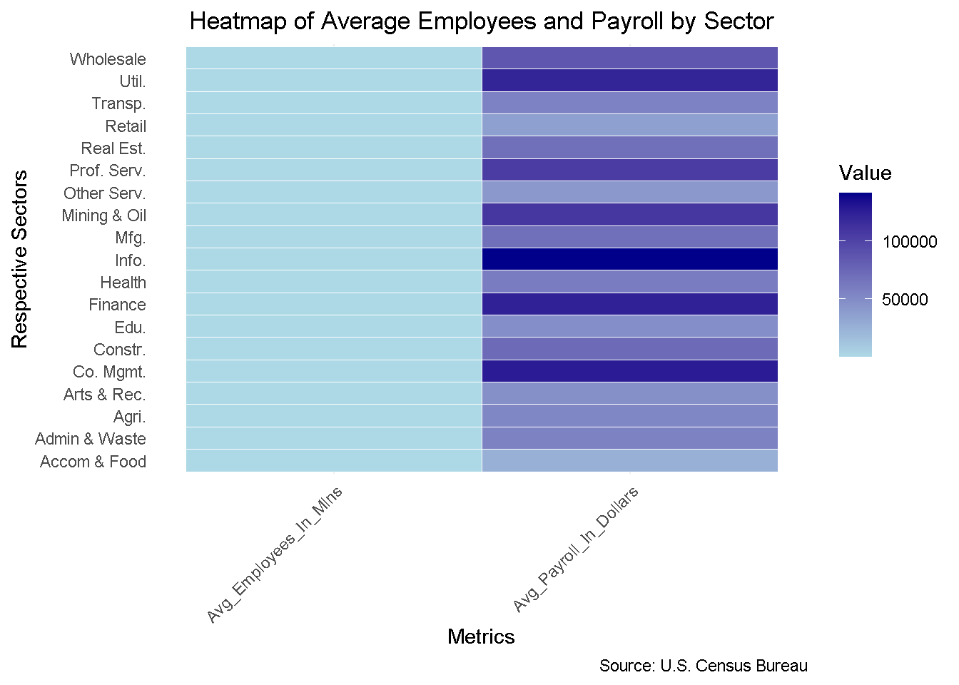
2. Sector-specific Heatmap of Average Workers and Payroll:

The heatmap makes it possible to compare two indicators directly, for all sectors: the average payroll and the average number of workers. Darker hues imply greater values, such as in Information, Finance, and Company Management sectors, which provide larger payrolls. Lighter hues, on the other hand, indicate lower payroll values even for significant staff numbers in Accommodation & Food Services and Retail. The huge differences in labor size and salary between industries are effectively depicted in this graph.

Important characteristics:

The gradient from light blue to dark blue in the heatmap represents the magnitude of the data.
Readability is enhanced with flipped coordinates, or sectors on the Y-axis.
Comparing sectors simultaneously on two important parameters is made simple by a clear structure.

heat_map_information <- merging_info %>%
  pivot_longer(cols = c("Avg_Employees_In_Mlns", "Avg_Payroll_In_Dollars"),
               names_to = "Metrics",
               values_to = "Value")

ggplot(heat_map_information, aes(x = Respective_Sectors, y = Metrics, fill = Value)) +
  geom_tile(color = "white") +
  scale_fill_gradient(low = "lightblue", high = "darkblue") +
  coord_flip() +  # Flip coordinates for better readability
  labs(title = "Heatmap of Average Employees and Payroll by Sector",
       x = "Respective Sectors",
       y = "Metrics",
       fill = "Value",
       caption = "Source: U.S. Census Bureau") +
  theme_minimal() +
  theme(axis.text.x = element_text(angle = 45, hjust = 1),
        plot.title = element_text(hjust = 0.5),
        panel.grid.major.y = element_blank())