colnames(employees_info)[1] <-"Respective_Sectors"colnames(payroll_info)[1] <-"Respective_Sectors"merging_info <-merge(employees_info, payroll_info, by ="Respective_Sectors")
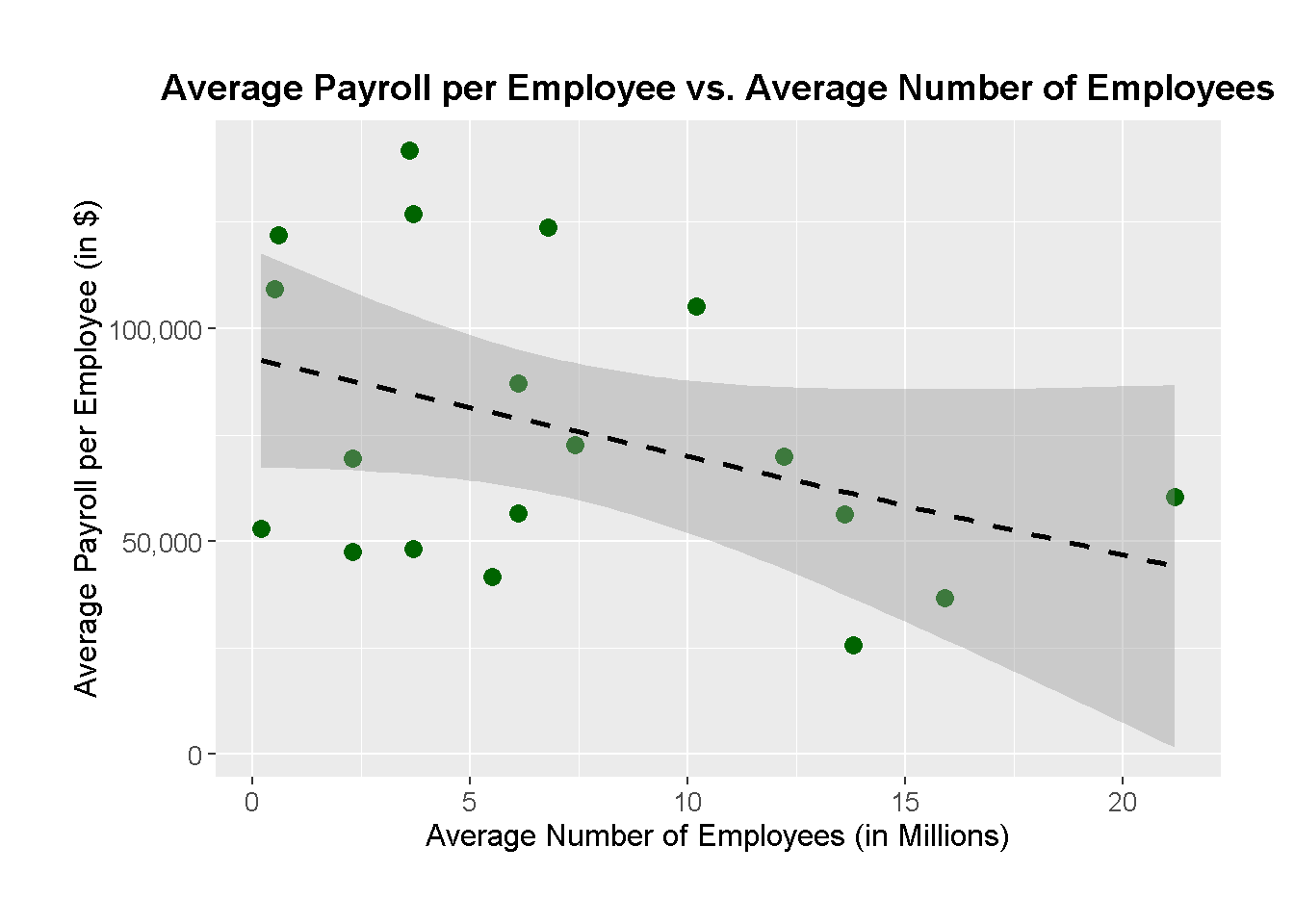
ggplot(merging_info, aes(x = Avg_Employees_In_Mlns, y = Avg_Payroll_In_Dollars)) +geom_point(color ='darkgreen', size =3) +geom_smooth(method ="lm", linetype ="dashed", color ="black") +labs(title ="Average Payroll per Employee vs. Average Number of Employees",x ="Average Number of Employees (in Millions)", y ="Average Payroll per Employee (in $)") +scale_y_continuous(labels = scales::comma) +# Adds commas for better readability on Y-axis scale_x_continuous(labels = scales::comma) +# Adds commas for better readability on X-axis theme(plot.title =element_text(hjust =0.5, size =14, face ="bold"),axis.title.x =element_text(size =12),axis.title.y =element_text(size =12),axis.text =element_text(size =10),plot.margin =margin(1, 1, 1, 1, "cm"))
`geom_smooth()` using formula = 'y ~ x'
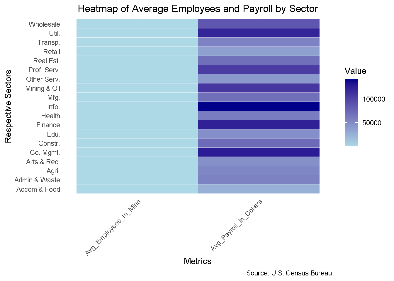
heat_map_information <- merging_info %>%pivot_longer(cols =c("Avg_Employees_In_Mlns", "Avg_Payroll_In_Dollars"),names_to ="Metrics",values_to ="Value")ggplot(heat_map_information, aes(x = Respective_Sectors, y = Metrics, fill = Value)) +geom_tile(color ="white") +scale_fill_gradient(low ="lightblue", high ="darkblue") +coord_flip() +# Flip coordinates for better readability labs(title ="Heatmap of Average Employees and Payroll by Sector",x ="Respective Sectors",y ="Metrics",fill ="Value",caption ="Source: U.S. Census Bureau") +theme_minimal() +theme(axis.text.x =element_text(angle =45, hjust =1),plot.title =element_text(hjust =0.5),panel.grid.major.y =element_blank())
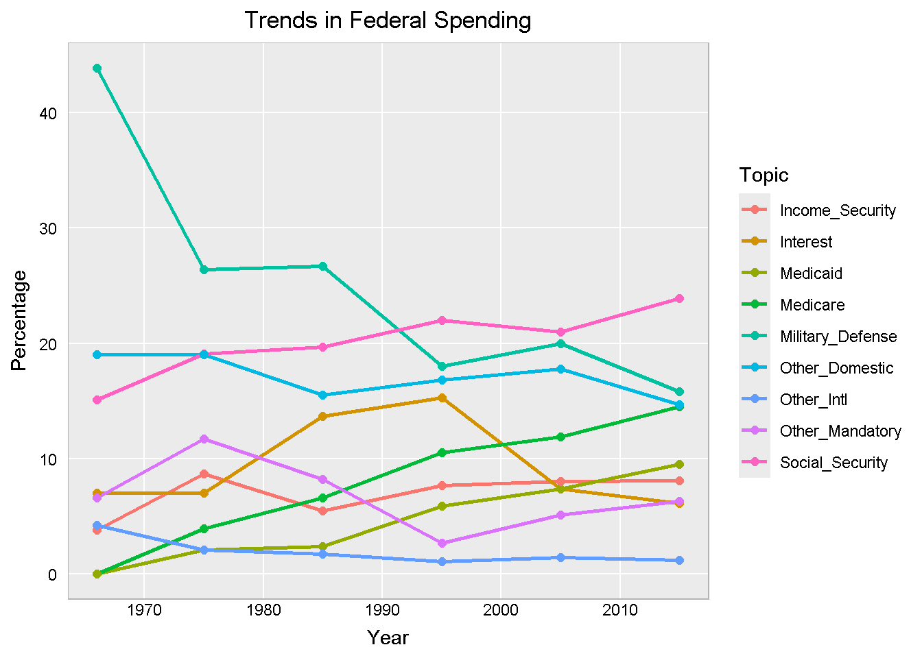
# Plot the data in Line Graphggplot(fs_long, aes(x = Year, y = Percentage, color = Topic)) +geom_line(size =1) +geom_point(size =2) +labs(title ="Trends in Federal Spending",x ="Year",y ="Percentage") +hw
Warning: Using `size` aesthetic for lines was deprecated in ggplot2 3.4.0.
ℹ Please use `linewidth` instead.
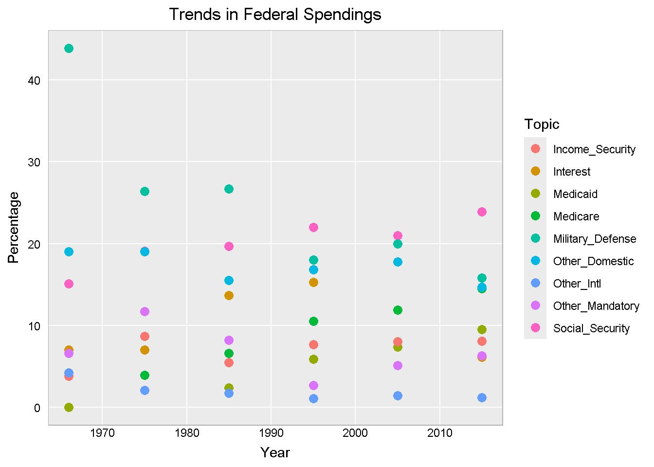
Plot the data in Scatter plot
# Plot the data in Scatter plotggplot(fs_long, aes(x = Year, y = Percentage, color = Topic)) +geom_point(size =3) +labs(title ="Trends in Federal Spendings",x ="Year", y ="Percentage") + hw