case2
Pie Chart Conversion into Line and Scatter Plots: An Extensive Examination of U.S. Federal Spending Patterns
Data visualization plays a crucial role in conveying information effectively, particularly in the realm of federal spending, where it is crucial to comprehend patterns across time, for a long time, traditional pie charts have been a common option for displaying financial allocations. As noted, “Just as with an enterprise’s financial statements, numbers mean nothing unless they can be compared to something else” [1], This project examines the benefits of converting pie charts into line and scatter plots, with a particular focus on government expenditure patterns in the United States across many decades.
Pie Chart Limitations
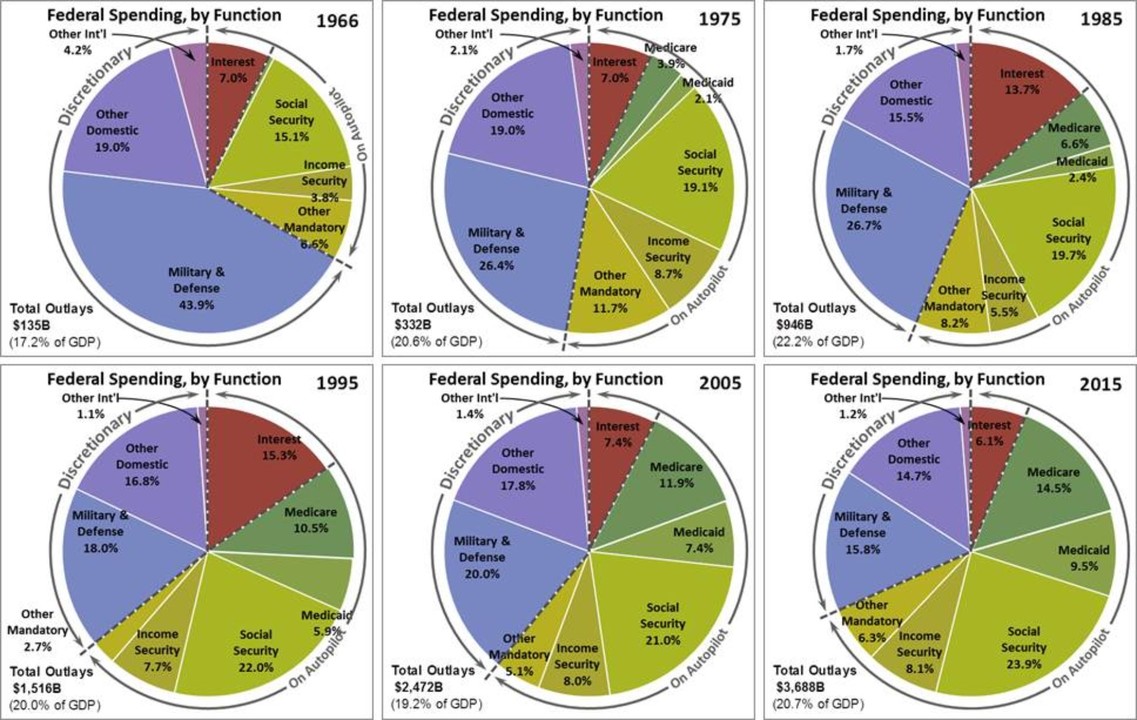
Pie charts give an overview of data, illustrating proportions at a specific moment in time. But they are lacking in a few respects.
Pie charts display data as slices of a whole, displaying proportions as opposed to trends. When attempting to display changes over time, this design gets difficult. It works well for exhibiting a single data point or a few categories. As previously said, “Numbers mean nothing unless they can be compared to something else, just as with an enterprise’s financial statements” [1]. As the analysis of U.S. federal government outlays reveals, pie charts are less helpful for analyzing trends in federal expenditure since they cannot compare statistics across several time periods or categories.
For instance, the attached pie chart shows how government expenditure is distributed in a given year, but it doesn’t show how these numbers have evolved over time.
Advantages of Line and Scatter Plots
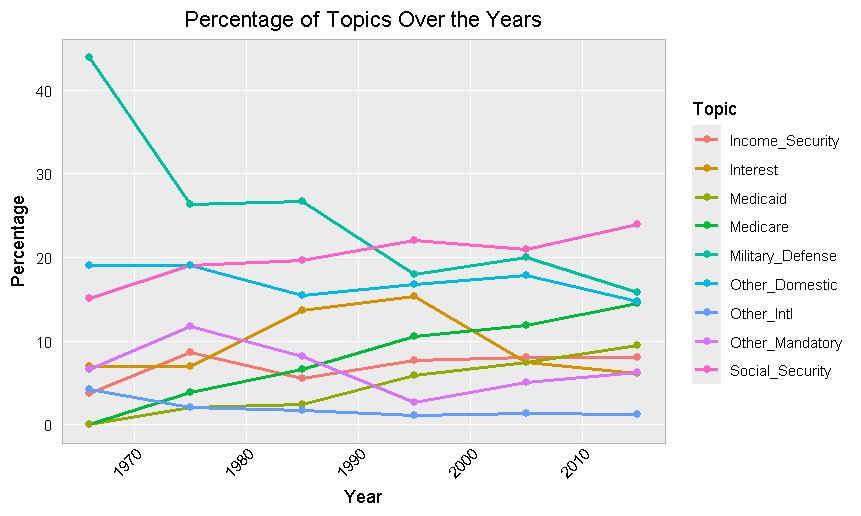
On the other hand, line charts work especially well for showing patterns over time. They show data points linked by lines, which facilitates the observation of value changes along a continuum. Viewers can rapidly identify patterns in this style by immediately recognizing rising or falling trends. “Line graphs are best for showing changes over time,” claims Few (2009) [2]. Line graphs offer a more complete perspective of fiscal trends by making it simple to see how required and discretionary spending have changed over the decades.
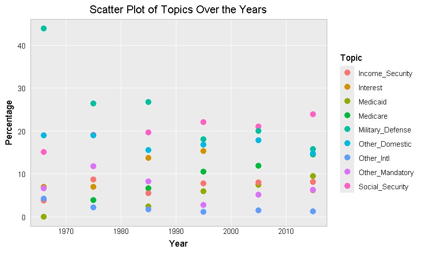
On the other hand, scatter plots help illustrate the relationship between two quantitative variables. They provide information that a pie chart just cannot, such as correlations and outliers. For instance, scatter plots provide for a more thorough analysis of changes in government spending by displaying the link over time between many spending categories (like Medicare and Social Security).
In this project,By emphasizing the correlation between healthcare expenditures over the studied years and mandatory spending increases as well as the decline in military spending since the times are peaceful today, the scatter plot offers further insights into spending patterns.
Trends in Federal Spending
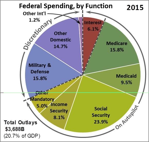
When pie charts are converted to line and scatter plots, significant trends in federal spending can be identified. Line graphs clearly illustrate long-term patterns in federal spending between 1966 and 2015. The line plot shows continuous and proportionate changes across categories, making it simpler to detect subtle shifts in priority. For example, military defense spending has steadily declined from 43.9% in 1966 to 15.8% in 2015, suggesting a decreasing emphasis on defense as international relations have become more peaceful over time. In contrast, Social Security has steadily climbed from 15.1% in 1966 to 23.9% in 2015, indicating an increased financial burden from an aging population.
Medicare and Medicaid, two healthcare-related categories, show an upward trend. Medicare increased rapidly from 3.9% to 14.5% by 2015, while Medicaid did the same, going from 2.1% to 9.5%. These developments are connected to legislative changes and the increased demand for financing for healthcare as life expectancy grows and medical treatment gets more expensive. The line graph, which clearly shows a reallocation of resources from defense to required social and healthcare programs, clearly highlights these long-term shifts in expenditure priority.
The scatter plot enriches this study and allows for a deeper understanding of the trends by emphasizing certain data points, as opposed to line graphs’ smooth trends, draw attention to significant points in federal expenditure by highlighting patterns or outliers that could otherwise be missed. The scatter plot, for example, highlights the peak of Interest on Debt spending in 1995, when it reached 15.3%, and then fell to 6.1% in 2015. This points to a brief increase in borrowing costs in the 1990s, which is a significant finding that merits more research.
The scatter plot illustrates the abrupt rises in Medicare and Medicaid throughout the 1980s and 1990s, which further enhances the examination of healthcare costs. These surges, which are identifiable as separate data points, are correlated with rising healthcare expenses and policy improvements, indicating the federal government’s increasing commitment to these industries. In addition, anomalies such as the notable decline in Military Defense from 1966 to 1975 are well illustrated, facilitating swift visual understanding of noteworthy variations across various time periods.
Conclusion
Pie charts help show comparisons in a fixed format at a specific point in time, but they are not very helpful for showing trends or changes over time. However, line and scatter plots offer a more dynamic and informative method to depict data, which facilitates our ability to track changes and trends in government spending. This study demonstrates how these more advanced visualization techniques make it possible to understand the dynamics of public finance on a deeper level and highlight crucial information that pie charts are unable to display.
Our understanding of how government expenditure evolves is improved by the use of line and scatter plots, which display trends across time as well as specific yearly patterns and anomalies. These visual tools provide policymakers and the public with a clearer “big picture” view of spending patterns, which is necessary to assess the implications for future budgets and the economy as a whole. Comprehending these trends is vital for anticipating future economic effects and making cautious financial choices.
References
1.Bolten, R. (2017, February 8). Oh, my pie chart hits the wall. LinkedIn. https://www.linkedin.com/pulse/oh-my-pie-chart-hits-wall-randall-bolten
2.Few, S. (2009). Now You See It: Simple Visualization Techniques for Quantitative Analysis. Oakland, CA: Analytics Press.